Magento 2 Upgrade

Earlswood GLC

Magento Upgrade Case Study

  • Website Design
  • Website Development
  • Responsive
  • Ecommerce

Upgrading from Magento 1 to Magento 2

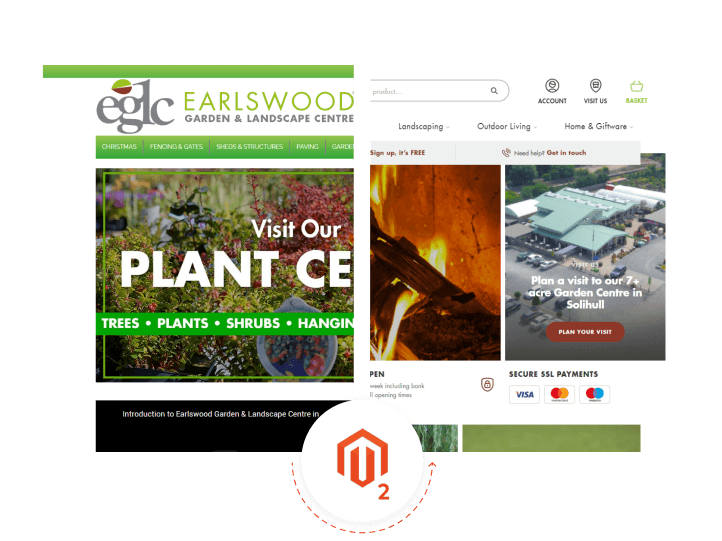
A garden centre based in Solihull came to us at isev, needing an upgrade to their Magento website. They were based on Magento 1, which was fast approaching its end of life, meaning that security updates would no longer be worked on for the system.

They needed to be moved onto the updated Magento 2 system, which would mean their website would be supported with all the latest features and security updates. This upgrade was also the perfect time to get a revamp of their website, keeping to a similar style and branding, but with a completely re-done customer experience.

Driving in-store visits

Though a majority of the products are shown on the website, as with any garden centre, there is simply too much to have all the items that are available there. There are seasonal specials, plants that cannot be delivered and more that can only be acquired in store.

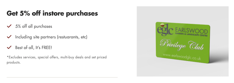
One of the elements we added to the website is highlighting the benefits of purchasing from the website with a bar that shows just below the menu on every page. One of the most important ones on here, is the 5% discount off in-store purchases.

earlswood-garden-centre-in-store-visit-discount

This takes customers to a form that allows them to sign up to get a 5% discount when they visit, which has multiple benefits, firstly, it helps drive customers to the garden centre, where they can see the full array of products available. Secondly, it helps drive sign-ups to the mailing list, which can then help the people that sign up to become repeat customers.

Improving category layouts

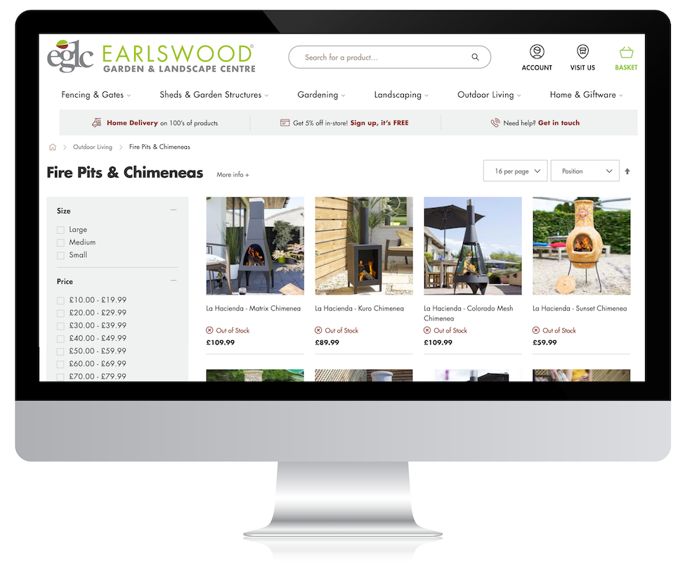
With the category pages, we decided to make improvements for when people landed on the page. First, we removed a section of banners from the right-hand side that advertised some of the offers that the garden centre had like the food available if you visited. This right-hand bar was a distraction from the main content they were there for on the page and it helps tidy up the look of the website, making it look cleaner and more professional.

Next, we put an accordion dropdown for the page content, this way when someone lands on the webpage, they can see the products straight away, and the content is still on the page, visible with the click of a button which then keeps all content for SEO purposes on there.

We also added filters to the category pages, something they did not have on their previous website. This would then help customers finding exactly what they wanted, especially in the categories that contain numerous products.

More appealing product pages

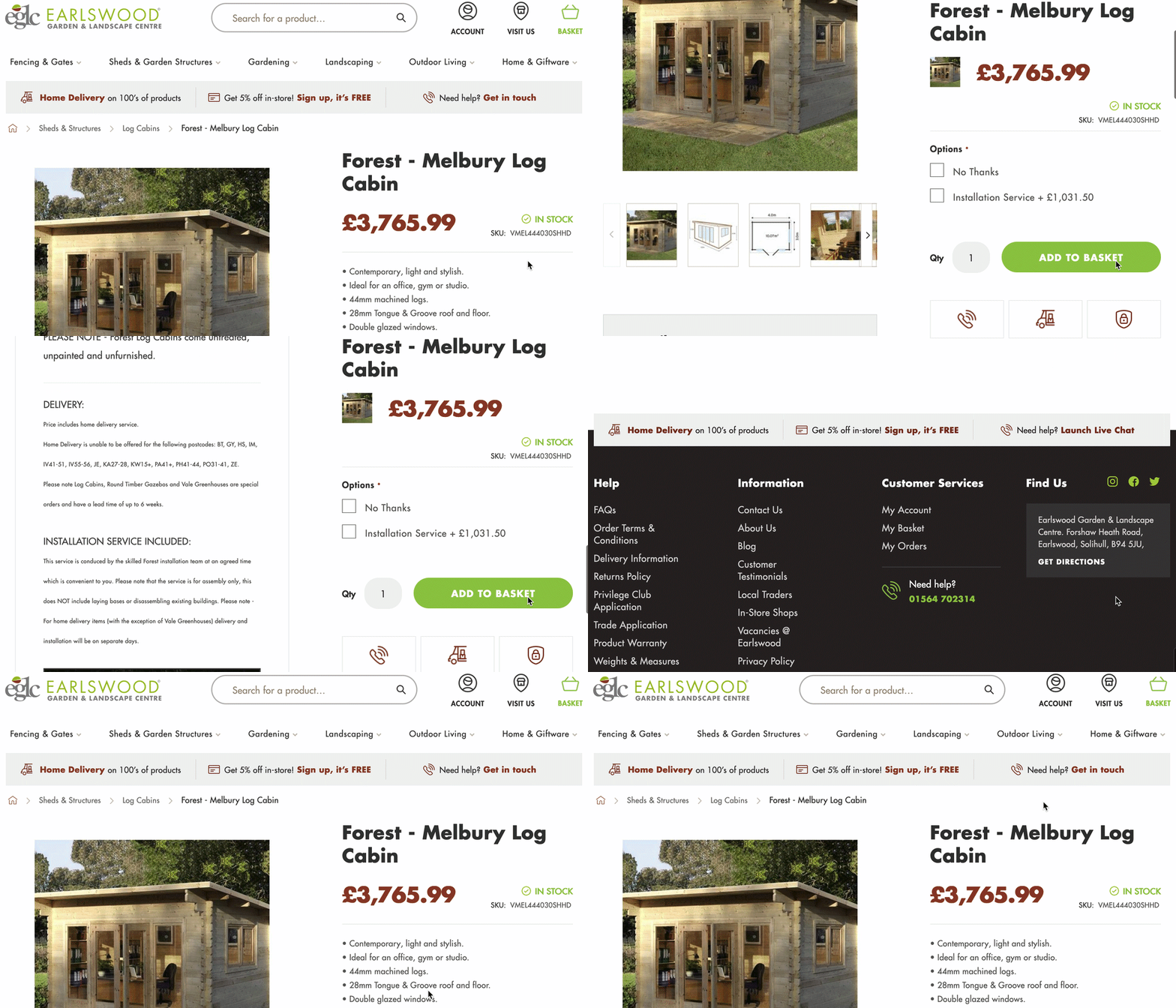
We wanted to make improvements to the website product pages, some of the best selling products like the sheds had long descriptions. What we did was at the top of the page, show the product images on the left half of the page with the full product description that could be seen under the image when scrolling down the page.

On the right side of the page, a bullet pointed list of the product details, the purchase options with add to basket, just under this, we put additional information that people may need and to help direct them to the purchase. These included a phone number to call for those who have questions, a link to the delivery details and the reinforcement that all payments are secured.

earlswood-product-page-CTAs

From here, to make it simple for customers to buy, we had the purchase options and add to basket button scroll down on the right side of the page moving further down. This is especially effective on product pages with large descriptions.

Simplifying the checkout process

The need for a simple effective checkout process can never be understated with an eCommerce website. With statistics saying that the average cart abandonment rate is over 70%, helping to make the process smooth and simple is essential.

From the checkout on their previous website, there were 6 steps:

  1. Contact details
  2. Delivery address
  3. Billing address
  4. Delivery options
  5. Payment details
  6. Confirm order

We took this and simplified this by combining sections such as delivery and contact details, removing redundancies like having to enter the delivery and billing address separately. After making these changes, we reduced this to 3 easy step checkout process.

  1. Contact, address, delivery options
  2. Payment details
  3. Confirm order
earlswood-checkout-process-steps

As well as simplifying the checkout process, we also made changes and removed other distractions from the page, such as the menu. This would mean that the only thing on the page for customers to focus on would be the checkout process, helping improve completed orders.

isev website support team

Need a website designing?

Talk to us! We're here to help you with what you need, big or small!

Get in touch today